
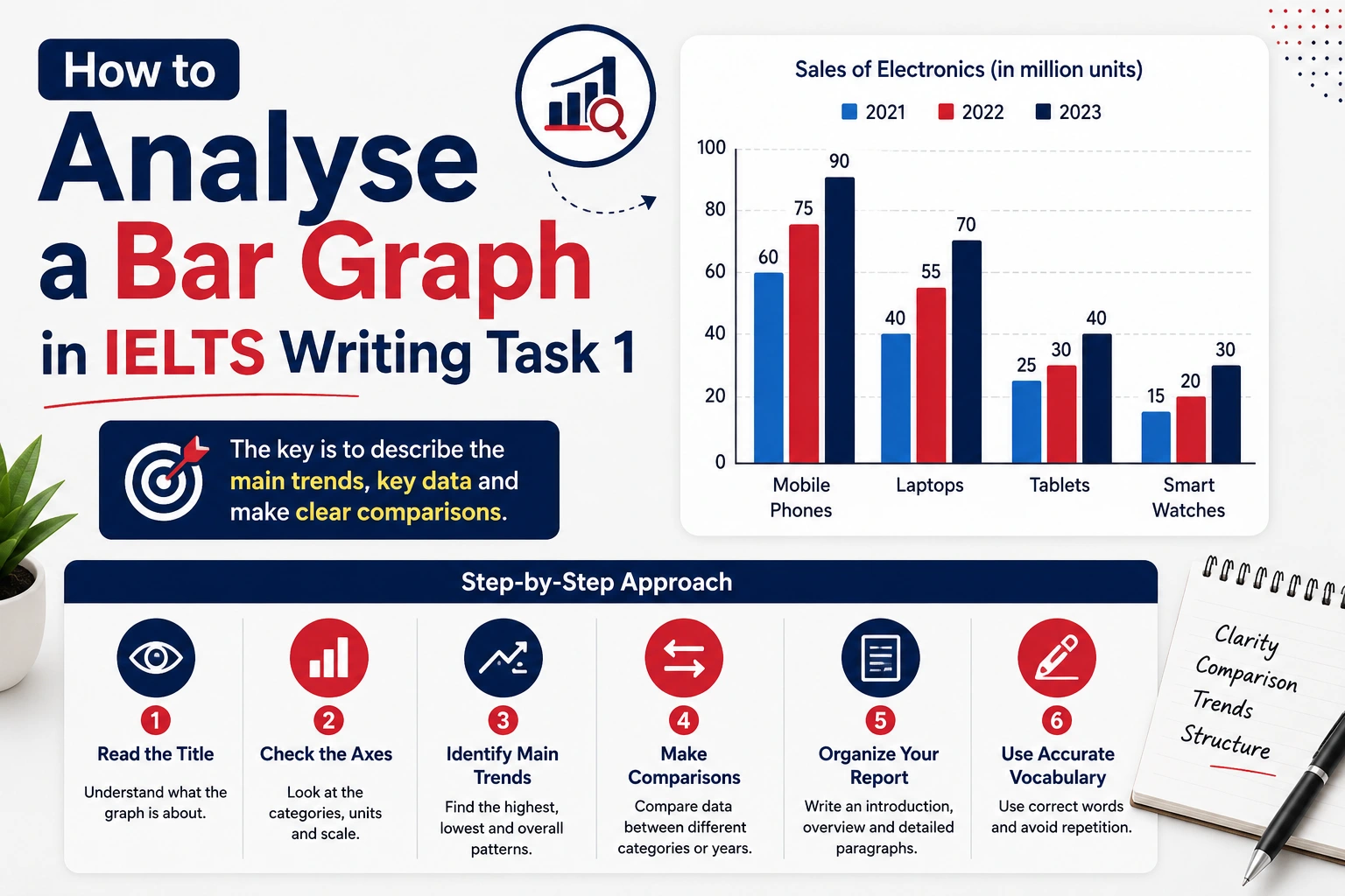
When you prepare for IELTS Writing Task 1, understanding how to analyse visual data is extremely important. Among all types of questions, bar graphs are among the most common. They measure changes, compare groups, and highlight trends clearly. In this blog, we will explain how to understand a bar graph correctly and how to present the information in a well-organised way. By following the steps below, you will be able to write a clear, accurate, and effective Task 1 report.
Writing Task 1 in the Academic module requires you to describe information presented in a chart, graph, table, map, or process. Your main responsibility is to summarise the key data and report the significant features without giving personal opinions. You must select and compare information accurately.
The test recommends spending around 20 minutes on this task. You must write at least 150 words, but going up to 170–190 words is usually ideal for clarity and detail.
A good response should have four paragraphs:
This paragraph structure helps present data logically and fulfils the organisation criteria.
You may receive:
Each type requires a different approach, but the structure stays roughly the same.
Examiners score your report on four main criteria:
Understanding these points helps you write in a more focused and confident manner.
Let us analyse the bar graph that shows divorce rates in Finland and Sweden from 2011 to 2015. When you get a bar graph in the exam, your first step is to observe the details carefully.
A student must pay attention to:
a. X-axis
This tells us the categories being measured. In this graph, the x-axis shows the years: 2011, 2012, 2013, 2014, and 2015.
b. Y-axis
This shows how the information is measured. Here, the y-axis shows percentages.
c. Time Period and Tense
Since the years are in the past, you must use past tense.
d. Categories
There are two categories: Finland and Sweden.
e. Two Ways to Compare
You can compare data in two ways:
This method is clearer and more organised.
Introduce the chart and paraphrase the question.
Example:
“The bar chart compares the percentage of divorces in Finland and Sweden over five years from 2011 to 2015.”
Keep it short and factual.
This paragraph should present a general summary. Do not include numbers here.
You can mention:
These are the main trends the examiner wants to see.
Here is a clean, simple, trainer-friendly note you can directly use with your students.
No extra fluff — just practical guidance.
When writing the body paragraphs for a bar graph, students often get confused about which category to describe first. There are two correct approaches, and both are acceptable in IELTS. The choice depends on the graph and the student’s writing style.
Follow the Order of the Graph (Safer for Beginners)
This means describing the categories exactly as they appear in the title, colour labels, or x-axis order.
Use this approach when:
Example:
If the colour labels show Finland first and Sweden second, you describe Finland first in BP1.
Why this works:
Examiners expect a clear, simple, organised answer, and following the graph’s natural order keeps the writing structured.
Start with the Dominant Trend
This means describing the category that shows:
Use this approach when:
Example:
If Sweden consistently has higher divorce rates and shows a notable decline, starting with Sweden creates a cleaner logical flow.
Why this works:
IELTS rewards logical grouping and clear comparisons, not rigid order.
What NOT to Do
Focus on one country first. In this case, start with Finland.
You should:
Example points:
This paragraph shows a clear trend within one category.
Now discuss Sweden.
Example points:
This paragraph highlights the contrasting pattern.
Students can use these expressions:
These phrases improve cohesion and vocabulary range.
You may encounter:
Understanding the type helps you decide how to compare information.
Analysing a bar graph becomes easier when you know what to observe and how to organise your ideas. Always begin with the axes, identify the categories, look for patterns, and then plan your paragraphs in a clear four-part structure. With regular practice and proper guidance, you can easily present accurate comparisons and score well in Task 1.
At Focus Education, we help students understand every question type through examples, structured practice, and personalised feedback. If you want more such blogs on IELTS Writing, continue following our page for weekly updates and expert tips.